
Ideas That Stick, Drawn at the Speed of Thought
Why Visual Notes Thrive on Glass

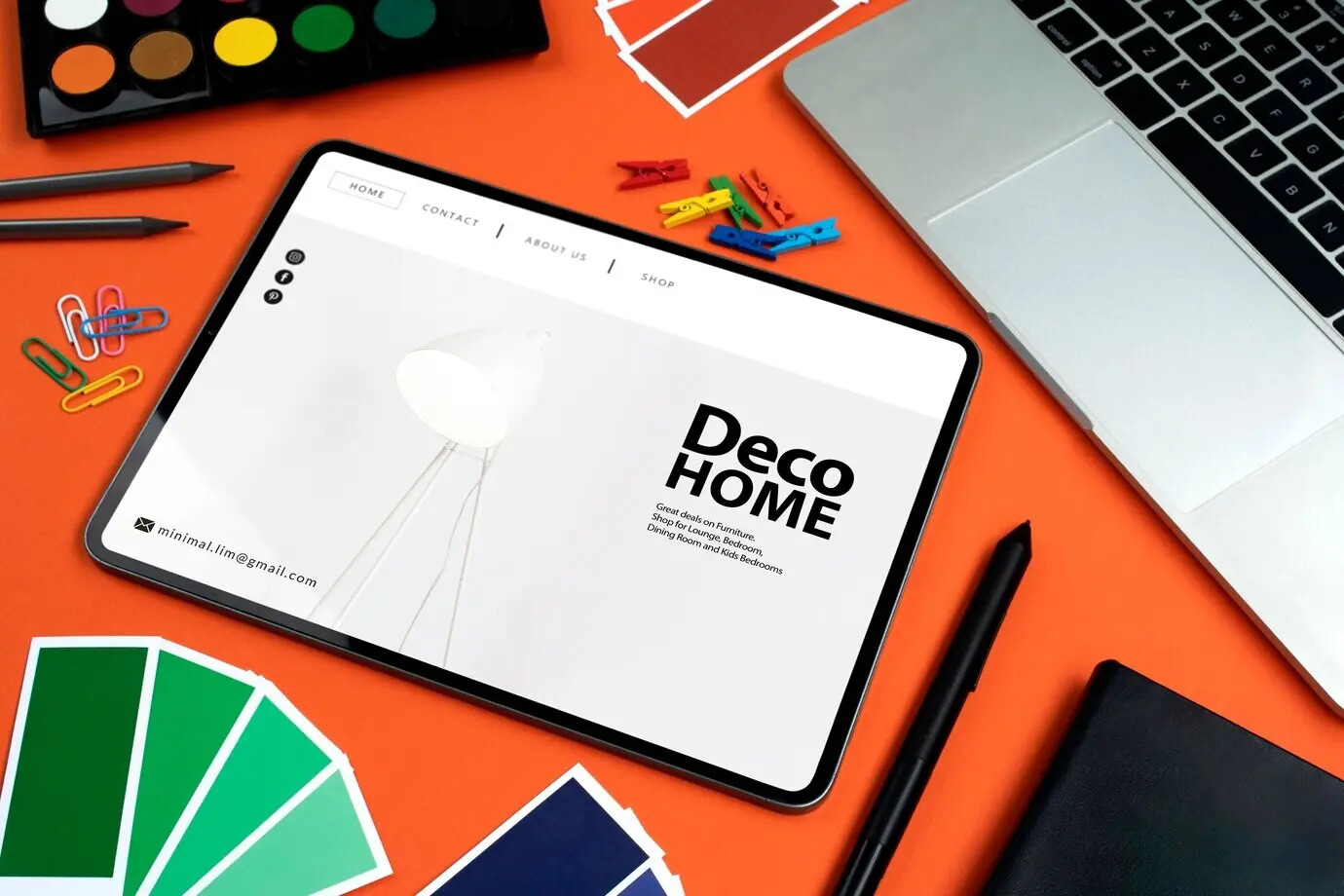
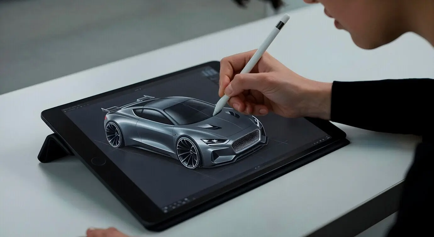
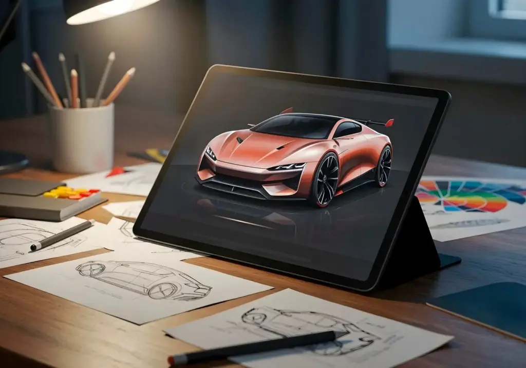
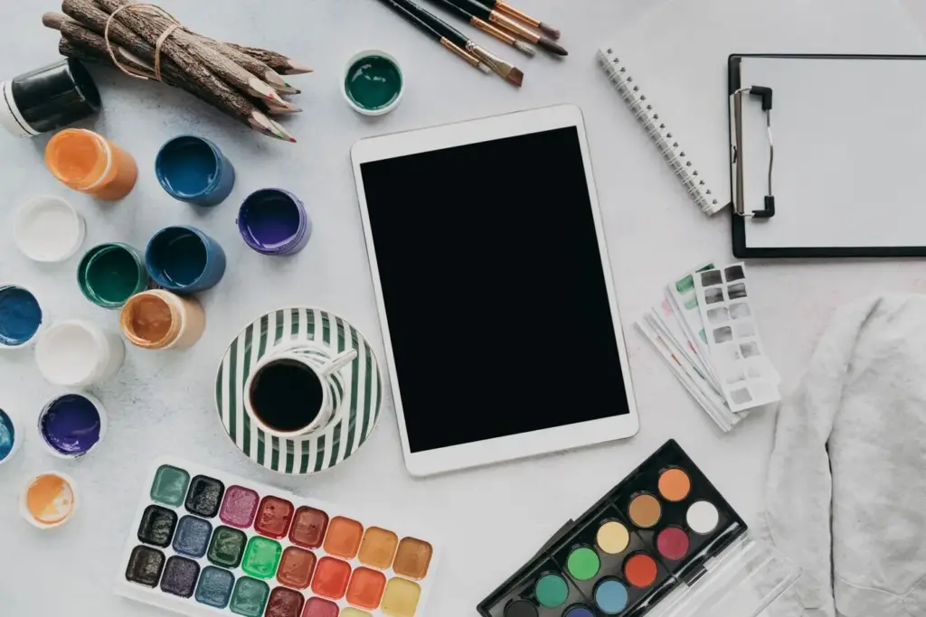
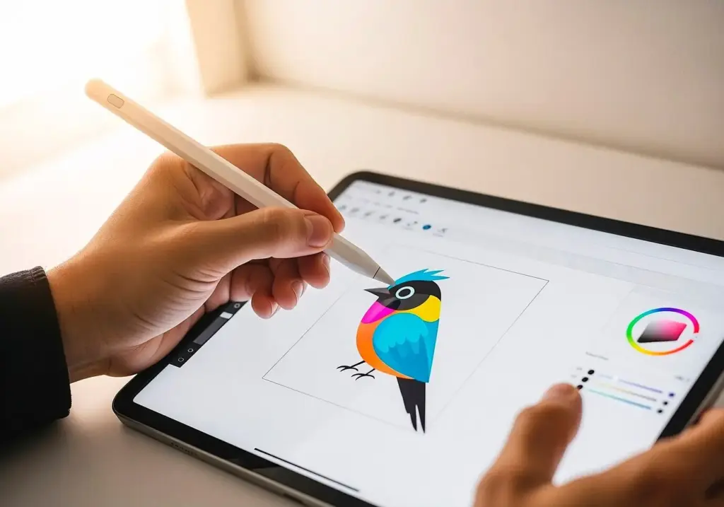
Picking the Canvas and the Pen
Vector Versus Raster, Explained Without Jargon
Brush Sets for Clarity, Not Clutter
Templates and Libraries That Save Time
From First Stroke to Shareable Insight

Building a Flexible Visual Vocabulary
Lettering Styles That Read at a Glance
Pick one clear style for body text and a thicker, friendly headline variant. Practice consistent x-height, spacing, and slant to prevent drift under pressure. Reserve all caps for brief labels only. Use negative space around headings to create breathing room. When screens are dim or slides busy, increase weight slightly for legibility. Consider dyslexia-friendly spacing and avoid decorative fonts. Remember: readers scan in patterns. Your lettering should guide that path gently, rewarding quick glances with confident understanding of structure and emphasis.
Containers and Connectors That Guide the Eye
Rely on rounded boxes, simple banners, and soft corner clouds rather than ornate frames that steal attention. Use contrast and proximity to group related thoughts. Connect ideas with arrows that convey meaning: thick for main flows, dashed for possibilities, curved for feedback cycles. Number steps to anchor sequence. Keep crossings minimal to reduce visual noise. Where space tightens, switch to nesting and callouts. The most effective structures feel almost invisible, gently steering readers from introduction to insight without demanding conscious effort.
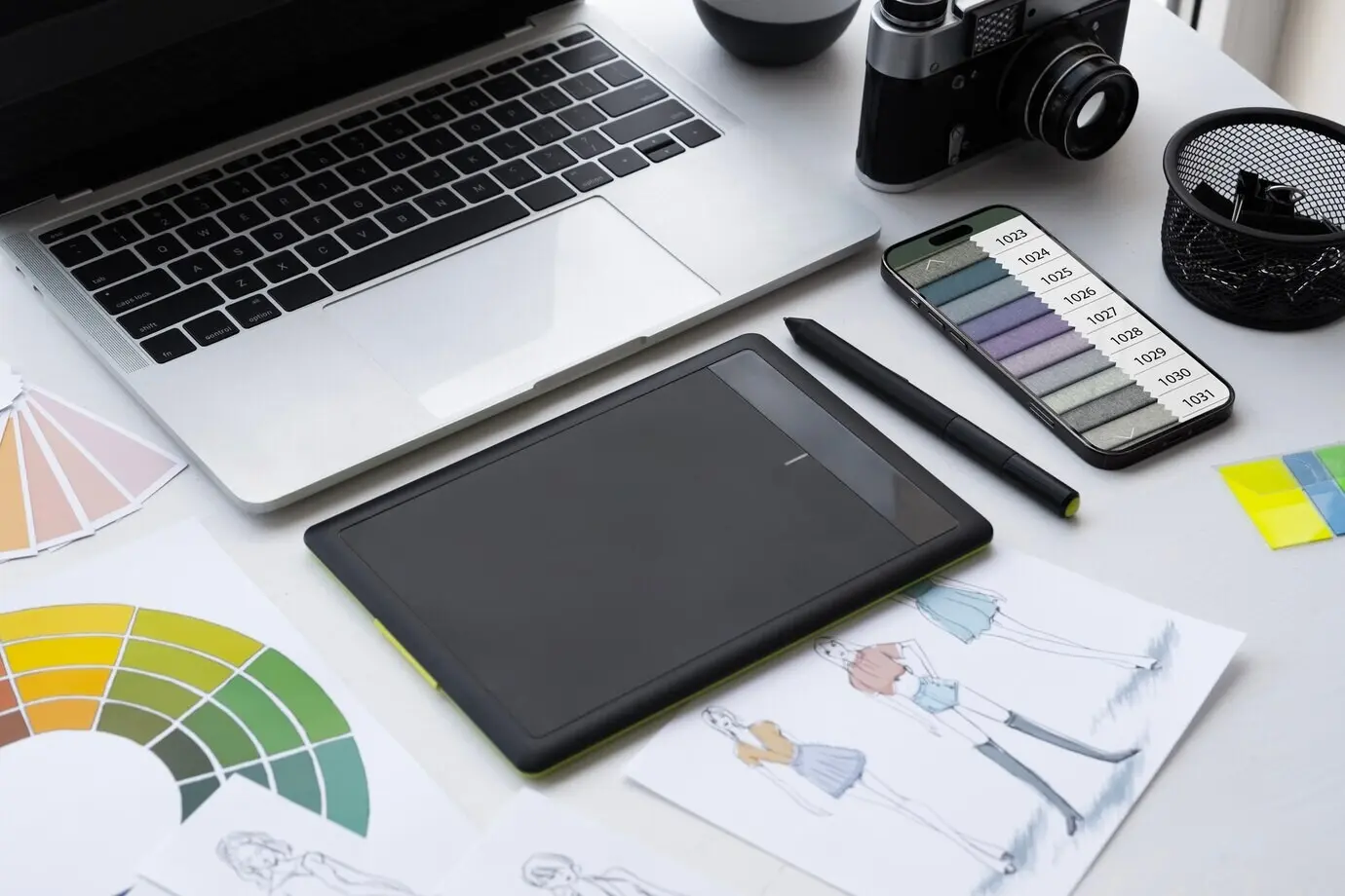
Color Systems That Survive Any Project
Start with a neutral ink plus two accents: one for emphasis, one for categorization. Add a soft gray for shadows and a warm highlight for focus. Test combinations on both dark and bright backgrounds. Ensure sufficient contrast for accessibility and projector variability. Document your palette with hex values and brush presets to stay consistent between apps. Avoid rainbow overload; rhythm matters more than novelty. When everyone recognizes your code at a glance, communication accelerates, and your pages remain calm under pressure.
Field Notes from Meetings, Classes, and Conferences
All Rights Reserved.