Sketch to Remember: Inside the Mind of Visual Note‑Taking
Step into a research‑grounded journey through the cognitive science of visual note‑taking and memory retention. Learn how dual coding, attention, and spaced retrieval transform quick sketches into durable understanding. Try approachable practices that make ideas visible, reduce overload, boost recall, and invite conversation. Share your experiments, ask questions, and help us build a community that turns complex concepts into pictures your future self can easily revisit and apply with confidence.
Why Images Anchor Learning When Words Drift
Decades of research show that pairing pictures with concise words creates richer memory traces than text alone. Dual coding engages complementary channels, while distinct visuals reduce interference and help you find information quickly later. When you sketch relationships, you also generate meaning, which deepens encoding. Here we connect everyday note pages to findings about attention, working memory limits, and why simple drawings often survive distractions that make dense paragraphs blur into forgettable noise.
Dual Coding You Can Feel
Imagine a quick drawing of a lighthouse next to a short phrase about guidance. The image activates visual pathways while the phrase engages verbal processing; together, they braid two routes to the same idea. This redundancy supports recall under stress and across contexts. You are not just decorating notes; you are engineering multiple cues that your brain can use later, even when one path feels blocked by fatigue or time pressure.
Taming Cognitive Load with Simple Shapes
Working memory is narrow, so sketching circles, arrows, and boxes can offload structure from your head onto the page. By chunking steps and relationships into visible groups, you lighten mental juggling and free attention for understanding. Replace long sentences with labeled clusters, then connect them sparingly. The result is a map that guides your eye, exposing gaps and misconceptions quickly, and giving your future self a compact scaffold for efficient review without re-reading everything.
The Picture Superiority Advantage, Explained
Pictures tend to be remembered more readily than words because they carry rich, distinctive features and invite deeper processing. Even a crude icon captures shape, spatial layout, and implied action. Add a few targeted keywords and you amplify meaning without clutter. Weeks later, that humble sketch can spark rapid reconstruction of details surrounding it. This is not artistic talent at work; it is perceptual distinctiveness and meaningful association doing heavy lifting for your memory.
Designing Pages That Guide the Eye and Mind
A well‑designed page distributes attention intentionally. Hierarchy, whitespace, and consistent cues make complex material navigable, while expressive lines and captions preserve nuance. Treat your page like a tiny interface: each element should signal purpose and relationships. By limiting decorative noise, you let important ideas stand out. The goal is not perfection, but clarity that supports comprehension now and accelerates retrieval later, especially when revisiting notes quickly before a discussion, test, or decision.
Layered Reviews that Build Durable Traces
After the first pass, return the next day for two minutes: circle uncertainties and add a short summary strip. A few days later, add connections to prior pages. Each layer is light, quick, and focused on relationships, not transcription. This spacing signals importance to your brain and strengthens neural patterns. You will notice how small additions compound powerfully, converting a once‑messy capture into a refined map that supports effortless refreshers before high‑stakes conversations.
Sketch Prompts for Active Recall
Cover labels, then test yourself using only the icons and arrows. Can you regenerate the explanation, formula, or argument from these cues? If not, add a more distinctive marker or clearer link. Create tiny flashcards by cropping sections of your page and quizzing yourself later. Retrieval is effortful by design; that difficulty strengthens memory. Visual prompts keep the challenge productive by pointing your mind toward the right structures without giving away the answers.
Hippocampal Binding and Spatial Pages
Your page is a small landscape. When you place concepts in stable locations, the hippocampus can bind ideas to that spatial layout, similar to a mental map. Later, recalling the page’s structure cues details tucked in each region. This is why consistent templates matter. A title band at the top becomes a reliable landmark; a lower‑right action corner cues next steps. Spatial regularity is a surprisingly powerful, low‑effort way to support reconstruction.
Attention, Saccades, and Signal Detection
Our eyes jump in quick saccades, sampling salient features. Bold headers, distinct icons, and clean separators guide those jumps, reducing search costs. When everything looks the same, attention drifts; when hierarchy is clear, the most important elements receive more processing time. Think like a signal engineer: increase contrast where it matters, dampen visual noise elsewhere. These micro‑choices create smoother eye movements, calmer cognition, and stronger memory for the exact ideas you intended to emphasize.

Tools, Workflows, and Friction That Helps
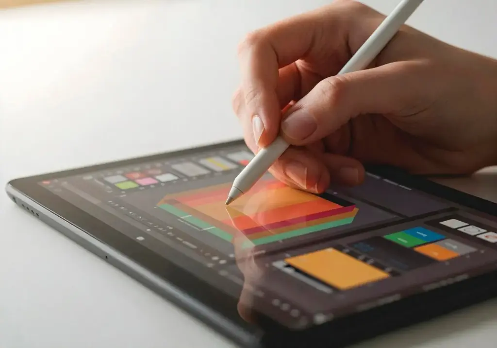
Choose tools that minimize unhelpful friction while preserving enough resistance to slow down and think. Paper invites focus and tactile feedback; tablets offer layers, zoom, and instant duplication. Pens with quick‑dry ink prevent smearing during fast captures. Templates reduce decisions under time pressure. Whatever you pick, standardize a simple workflow for capture, quick review, and archiving. Consistency turns scattered notes into a dependable knowledge system you can search, share, and trust.
Practice, Community, and Sharing Your Thinking
Habits beat bursts. Short, frequent sessions build fluency, and sharing your pages invites feedback that accelerates clarity. Start small, then refine with gentle constraints: one icon per idea, three connectors per page, a 90‑second summary strip. Post a weekly reflection and ask for one insight you missed. Subscribe for new prompts, reply with experiments, and help others learn by showing your messy drafts, not just polished wins. Collective practice multiplies progress for everyone.

A 14‑Day Warm‑Up You Can Start Today
Commit to ten minutes daily. Days 1–3: capture simple talks using only boxes and arrows. Days 4–6: add three icons you reuse. Days 7–9: practice summaries in a single sentence strip. Days 10–12: experiment with color rules. Days 13–14: schedule two spaced reviews. Share one page publicly, invite critique, and note what felt effortless. The goal is momentum, not masterpieces, and a practical rhythm you can sustain when life gets busy.

Building an Icon Library that Grows with You
Start with core concepts: person, idea, process, time, decision, data, risk. For each, design a five‑stroke version you can draw under pressure. Capture variations as you encounter new contexts, and keep a reference sheet taped inside your notebook cover. Repetition hardens recognition, so reuse symbols relentlessly. When an icon confuses someone, refine it and record the change. Over months, your library becomes a shared language that speeds comprehension and stabilizes memory across pages.
All Rights Reserved.